
STEP 9: Add a Chart in Value Collaborator
Previous - Add a Help Text in Value Collaborator
Overview
This article explains how to create various types of charts, including Pie charts, Bar charts, Column charts, Group charts, Stack charts, and Waterfall charts. Each chart type serves a different purpose in data visualization, helping users display and interpret data more effectively. The article provides step-by-step instructions on creating these charts, covering the customization options available for each. Whether you're looking to show proportions with Pie charts, compare categories with Bar and Column charts, or visualize changes over time with Waterfall charts, this guide offers valuable insights on selecting and creating the right chart for your data.
Step-by-Step Guide
-
Follow the steps to Upload Your Model / Create a Visualizer Type.

- Click Value Collaborator on the Visualizer Type page. When the page appears click the Save button on the top navigation or follow the steps to Enable the AutoSave Feature in Value Collaborator.

-
Click the particular tab or section where you want the Chart added.

- Click Chart Builder.

- You can see that there are 6 chart types.
Pie
-
Click to select Pie as the Type.
-
Enter a name in the Panel Name field. Give an appropriate name since the name might appear on the Prototype page.
- Click to select the Value Type i.e. whether the values should appear as currency, percent, or amount.

-
Click to activate the Donut toggle button if you want to show values in a Donut chart. You can see that the Pie chart below changes to a Donut chart.
-
Click Donut Properties to expand the section. Click the Inner Size spin box to select the size of the inner circle.
-
Click to activate the 3D Feature toggle button, if you want the chart to reflect 3D features.
- Click to activate the Slice On Zero toggle button if you do not want the chart to show zero values.

- Click inside the Variables text box and select from the list of variables that appear.

- Click Variable Details to expand the section. You can see the code references and the variable names. As the variable names appear on the chart, you can edit the names to your liking.

-
Click to activate the Title toggle button. Click Title Properties to expand the section.
-
Enter a name in the Title textbox to add a title to the chart.
-
You can also change the font weight, font size, and font color.
-
Click to activate the Sub Title toggle button. Click Sub Title Properties to expand the section.
-
Enter text in the Sub Title textbox to add a subtitle to the chart.
- You can also change the font weight, font size, and font color.

-
Click to activate the Data Labels toggle button and then click Data Label Properties to expand the section.
-
You can also change the font size, weight, and color.
-
Click to activate the Legends toggle button and then click Legend Properties to expand the section.
-
You can also change the font size, weight, and color.
-
Click to activate the Tooltip toggle button and then click Tooltip Properties to expand the section.
- You can also change the font size, weight, and color.

-
Click Create.
- Click Prototype.

- The chart appears on the Prototype page.
Bar

-
Click to select Bar as the Type.
-
Enter a name in the Panel Name field. Give an appropriate name since the name might appear on the Prototype page.
-
Click to select the Value Type i.e. whether the values should appear as currency, percent, or amount.
-
Click to activate the 3D Feature toggle button, if you want the chart to reflect 3D features.
- Click to activate the Slice On Zero toggle button if you do not want the chart to show zero values.

-
To add Variables, Title, and Sub Title, follow the steps as shown in the Pie chart.
- To change Variable Details and the font color, font size, and font weight of Data Labels and Tooltips, follow the steps as shown in the Pie chart.

-
Click to activate the X-Axis toggle button and then click X-Axis Properties.
-
Enter a name in the Title text box. You can also change the font color, font size, and font weight.
-
Click to activate the Y-Axis toggle button and then click Y-Axis Properties.
- Enter a name in the Title text box. You can also change the font color, font size, and font weight.

-
Click Create.
- Click Prototype.

- The chart appears on the Prototype page.
Column

-
Click to select Column as the Type.
- Follow the steps in the Bar chart.

- On clicking the Create button and then clicking the Prototype button on the top navigation, you can see a Bar chart on the Prototype page.
Group

-
Click to select Group as the Type.
-
Enter a name in the Panel Name field. Give an appropriate name since the name might appear on the Prototype page.
-
Click to select the Value Type i.e. whether the values should appear as currency, percent, or amount.
-
Click to activate the 3D Feature toggle button, if you want the chart to reflect 3D features.
- Click to activate the Slice On Zero toggle button if you do not want the chart to show zero values.

- The Columns in group field shows 2 (groups) by default. You can add any number of groups. Enter the number directly in the textbox or use spin box to select the number of groups.

- Enter a name for both groups in the text boxes.

-
Click inside the textbox to select the variables from the list. You can add any number of variables. You can choose a different color for the group.
- Follow the steps for Group 2.

-
You can see that a new section named Categories has appeared.
-
Click Categories to expand the section.
- Enter the name of the variable in each Category textbox.

- Click the Marked spline for any group and you can see that instead of the columns, the variables of that particular group appear as a Line chart.

- When you click the Marked spline for both groups, the chart will appear as a Line chart. You can create a Line chart using this method.

- Follow the steps mentioned in the Pie chart and Column chart.
- Click Create. and then click Prototype.

- The Group chart appears on the Prototype page.
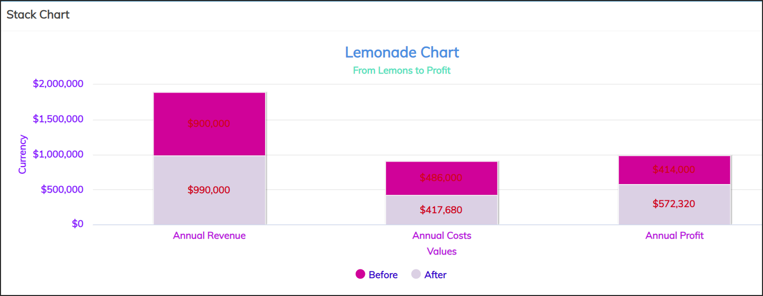
Stack

-
Click to select Stack as the Type.
-
Follow the steps in the Group chart.
- Click Create and then click the Prototype button on the top navigation.

- You can see the Stack chart on the Prototype page.
Waterfall

-
Click to select Waterfall as the Type.
-
Enter a name in the Panel Name field. Give an appropriate name since the name might appear on the Prototype page.
-
Click to select the Value Type i.e. whether the values should appear as currency, percent, or amount.
-
Click to activate the 3D Feature toggle button, if you want the chart to reflect 3D features.
- Click to activate the Slice On Zero toggle button if you do not want the chart to show zero values.

-
The Sum Bar toggle button is found activated. Click Sum Bar Properties to expand the section.
-
You can enter a new title in the Bar Name field.
-
Follow the steps in the Bar chart.
- Click Create and then click the Prototype button on the top navigation.

- You can see the Waterfall chart on the Prototype page.
Editing a Chart

-
On the Value Collaborator page, click Extensions and then click Edit.
- Make the necessary changes such as changing variables or chart type and then click Update.
Copying a Chart

- Click Copy.

- A copy of the chart appears below the original chart. Click the name to add a suitable one.
Related Topics: